Introduction to flexbox
Flex enable containers to adust items’ width/height/order to best fill the space in different kinds of screen sizes in a simple way.
How to use
.flex-element {
  display: -webkit-flex; /* Webkit core browerer such as Safari */
  display: flex;
}
Then all the children elements will lose float, clear,vertical-align properties.
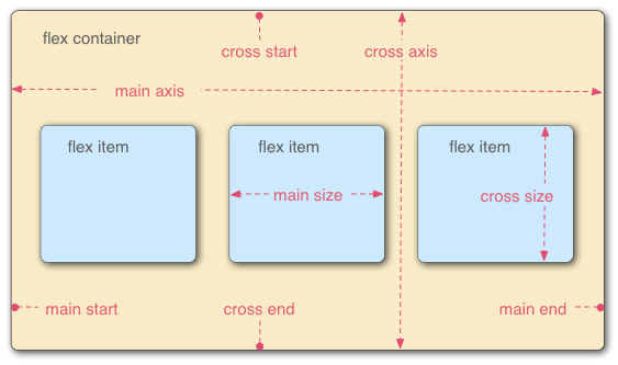
The layout of a flex container looks like below:
There are six properties in a flex container:
flex-direction – How items are placed
flex-direction: row | row-reverse | column | column-reverse;
flex-wrap How items are fitted
flex-wrap: nowrap | wrap | wrap-reverse;
flex-flow conbine flex-direction and flex-wrap
flex-flow: <flex-direction> || <flex-wrap>;
- justify-content How items align along the main axis
justify-content: flex-start | flex-end | center | space-between | space-around;